Friday 8 April 2011

Marketing and myspace

I have created a band MySpace page to help promote and market our band 'Canute'. It includes a blog, tour dates, personal comments, photos and music.


I chose to use an image of the band as the background instead of something plain as to connect with the fans, it feels more personal to see something along these lines. There is general information which allows fan to read information about the group, involving band members, influences and record label etc. The music section will allow people to listen to and download Canute's debut single 'Shark in the Water'. I have posted several 'statuses' to show that the band do use this website regularly and like to update fans on what they are up to. 


The URL of the MySpace page is: www.myspace.com/officialcanutemusic

Thursday 7 April 2011

Final covers


Album cover final designs 2

The following images show how I got to the final image for the back of my album cover


This screenshot shows the image I began with before making any changes


The next thing I did was crop the image


I then added a barcode and text to make a more professional cover


I chose to use rubber ducks as the back image of my cover as I feel its very contemporary and reflects the meaning of our band's name and album title. The image is blurred in the background so all the focus goes towards the rubber ducks, this also reflects the name of one of the song titles. I used the same font for the song list and artist name for continuity factors and it is also the font that represents the band themselves. I believe the barcode is a necessary item to include, its brings professional feel to the cover. The text i included in the top right hand corner also does this, I had a look at other album covers from professional singers and adapted the text to fit with my band.

Final album cover designs

The following images show how I created my final album cover, step by step, using the software Photoshop


This screenshot shows the beginning image I had before making any changes


I then cropped the image to a more suitable size


I had a play around with the hues and colour's of the image and changed the colour balance until I managed to reach this


I then added text using the fonts 'School House Cursive' and 'Gabriola'


I then added the 5 star's and text around it


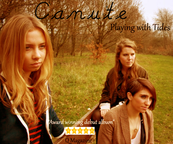
I chose this image as I feels it represents our band well. The positioning of Madeleine is code for the fact she is the lead singer, her image is the largest. The second most important singer is Danielle and is positioned second closest to the audience. Lucy is furthest away and her image is slightly blurred. I chose this colouring as it is very calming, I have seen this colour among many indie bands. All three artists are looking towards the same direction, this links the three of them. I chose to include the 5 star's and text to give my cover a more professional feel. I have used the typical conventions of album covers including artist name and album name. The text i chose for the artist name is 'flowy' and personal as if handwritten, I believe this gives the artist and audience a connection and allows the fans to really feel like they can relate the band. The font of the album name is more sophisticated and shows a 'grown up' feel to the album.

Friday 18 March 2011

Album cover art

When about to create my final design ideas i decided to and carefully go through the images I had, to see which ones would work and how. I drew up some rough ideas on paper and then used the images to adapt these.


This was the first idea for my album cover. I chose this as it breaks the conventions of a normal album cover. The colouring is not something you would normally, especially amongst indie rock bands. The positioning of the artists is also unusual, it does not show any distinguish between the lead singer and the other band members.

Rubber ducks..

As our album cover is called 'Playing with Tides' and our band name 'Canute' we wanted to use something to represent this, and coming up with the rubber ducks idea allowed us to be more 'playful' and 'bubbly' rather than being serious all the time. Using this juxtaposition comes up frquently amongst indi-rock bands as no one wants to be seen as to ;serious'. It allows a bit of fun to be added to our cover image.

Album cover ideas

On March 15th we all went out as a group to take some photos for are album art. We came up with some very good ideas and ended up with some brilliant shots. here are a few:

We wanted to take a large range of images to allow ourselves to be more flexible with our final cover designs. With a large aray of photos we can try out many different ideas.

Post Modern album covers

The Clash - London Calling

The album cover has all the typical conventions you would expect to see from any album cover for example, the artist name, album name and an image of the artist. The image has a very 'rock', 'rebellious' look about it due to the youthful, frustrating stance of the artist. He is positioned centrally with a very strong 'pose'. The blurring of the image suggests motion and the black and white suggests an edgy, serious, sencerty sense of conviction. Then in juxtaposition to this, we have the album name. In a colourful, bold font it suggests a happy, comic feel. It grabs the audience's attention and was made to hold focus suggesting a playful, bubbly, fun side to the serious bellion.

This album was infact a hommage to Elvis Presley's very first album...


This uses the same serious black and white image yet playful font and facial expression, this is how we know it is not a parody. The Clash have used the same codes and conventions to build an album cover almost exactly the same as Elvis Presley's, taking it seriously.

Post Modernism


All the people mentioned above are closely recognised with modernism creating pieces of work that will in years to come still be recognised.
Post Modernism is a movement away from modernism and they want the audience to be conciously aware that they are watching a text. There are two ways of doing this:
  • Technical - camera focusing
  • Intertextuality - illusions
The following three things all make you aware of other texts (allusions).


Intertextuality - making reference to another text. For example, in Lady Gaga's video for telephone they make reference to Kill Bill.


Parody - mocking the original text e.g Scary Movie


Hommage - celebrating the original text

Tuesday 15 February 2011

Album Covers


I created a collage of album covers for inspiration which includes a majority of different album arts and genres. They range from the 1960s right up until the present. All the album covers I have chosen are all ones I like and feel represent the artist well. Train's album art for 'Save me, San Francisco' clearly tells us the artist name, in the font that is recognisable to them. They have avoided bright, bold colours which I have found with the majority of indie bands. The background image of San Francisco bridge and the city buildings is blurred and does not stand out, our attention is drawn to the bird, which is central.
The XX's album cover is very simple yet very effective. The only image we can see is the large white 'X' on a black background. These colours clearly stand out and draw attention. Just from seeing this image we know who the artist is.
Gary Jules's album cover makes good use of the camera. It is defocused on his face and focused on his fist which takes up the majority of the space, this could easily represent anger but then the star sort of says the opposite.
Franki Valli and the Four Season's album cover suggests not a lot of money was spent on it, a simple blue background with a cut out image of the artists. It is very simple and plain to look at.
Then you have others which are very busy, for example The Beatles' album cover which consists of a large group of people along with the artist name in flowers. The cover is full of bright, striking colours which stand out. All the people standing behind the band have all passed away, it suggests they were all an inspiration. 
Mumford and Sons' album cover is quite similar to one of the Oasis one's, both being rather naturalistic. The four men are standing with their instruments which suggests their life revolves around their music. Two of them are standing above the others which shows a hierarchy of importance. The bright, blue sky suggests happiness and freedom.

Tuesday 8 February 2011

Band name and Album name

As a group we have decided on a band and album name which are as follows:

  • Artist name: Canute
  • Album name: Playing with Tides
Since creating my album cover prelims my group and I have decided to change the band name from 'Azura' to 'Canute', making reference to 'King Canute the Great'.
He was a Viking warrior turned english king, 'THE KING WHO COULD NOT STOP THE SEA BUT STEMMED THE VIKING TIDE ON ENGLAND'S SHORES'
Lengend says that he was so great, he could command the tides of the sea to go back but he, himself knew his limitation so he had his throne carried to the seashore and sat on it as the tide came in, commanding the waves to advance no further. When they didn't, he had made his point that, though the deeds of kings might appear 'great' in the minds of men, they were as nothing in the face of God's power.

With our album name being 'Playing with Tides' we thought this reference was a serious, celebration hommage to Canute himself. Everything has meaning behind it and this is ours

Tuesday 1 February 2011

The music industry

For the last decade now, the music industry has begun facing a huge online revolution which is fast becoming a huge problem for the big record companies. Artists and bands are using something known as viral marketing as a way of informing, communicating and selling their music to their fans. For example, the duo Nizlopi hit a world wide phenoma with their track 'The JCB song' which started off in an email to just 20 people. These people would then show the song to their friends, it was placed online and extremely quickly sent around the world. The track cost the boys very little and went on to be in the top 10 songs of that year, yet Nizlopi were told by a record label that this song would never sell but they continued to believe it would, so ignoring the record companies and thanks to the internet it meant they did not need a huge marketing machine and went on to sell half a million copies of the track on their own label, 'FDM'.
There any many other artists and bands that also use viral marketing and is a massive key to their success. Gnarls Barkley's single 'crazy' was the first ever single to hit number 1 on internet downloads alone. Mick Hucknall from Simply Red has recently used the internet to start up his own record label 'simplyred.com' and back in 1994 created his own website which helped begin this entire revolution.


Many artists find that the internet is a massive way to keep them independent and more intimate with their fans, more often now artists do not want to be a part of a record label and want to 'go at it alone'. The Artic Monkeys a group from Sheffield found their fame through viral advertising and created their first CD, a demo sound track consisting of 17 songs and was released under the name of 'The Broadwalk'. The band copied a number of these CDs and gave them away to fans at gigs, these quickly made it onto the internet and were promptly 'file-shared' amongst fans. As the first sender shared the album they wanted to classify the CD and it was named 'Beneath the Boardwalk'.
The band got offers from various record labels but rejected each and everyone of them, refusing to change their 'sound' and 'look' but in 2005 they joint record company 'Domino' which was ran from the owners flat. They were attracted to the 'DIY ethic' and wouldn't change for anyone.


The internet is threatening to overturn the classical ways of signing artists and buying music, for example, people are more often than not searching online for websites by which they can download their favourite tracks for free. It is quick, easier and cheaper than going into a store to buy albums. Who wants to buy an entire album if they only want a few tracks off it? The music industry is in a huge circle the more they try to keep up with the internet and illegal downloading the further away they get. New websites are being made all the time and the big record companies and finding it almost impossible to stop it. The majority of people now download illegally and very unlikely to go back to buying from stores. But there is no reason why the music industry cannot embrace this revolution and work with it. If they continue to sue they are then unable to channel these opportunities in a positive way. If they can challenge the pirates to create easier ways about downloading tracks they can win over the consumers.

Wednesday 26 January 2011

Star Image, Train, Biffy Clyro


Train are a band from San Francisco, California, consisting of Pat Monahan, Jimmy Stafford and Scott Underwood. They formed in 1994 and their single 'Drops of Jupiter' was a grammy-award-winning song along with 'Calling all Angels' and 'Meet Virginia' topping the charts. They have found many ways of publicizing their music and building a fan base including television appearances, radio air time tours, intimate gigs and online pages on social networking sites etc.
Their audience are able to buy their singles and albums from stores such as HMV and download them from online stores such as itunes and spotify. Fans are also able to buy their products from amazon.co.uk and play.com and also from the bands official website.
  • Band website: www.trainline.com 
  • MySpace: www.myspace.com/train
  • Facebook: www.facebook.com/train
  • Twitter: www.twitter.com/train
  • Youtube channel: TrainMusic
You can get to all of these web pages from their official website where fans are able to also look on the different pages they have for example, biography, music, news media, tour and shop. You can also join their mailing list which allows you to receive news and information first etc.


Biffy Clyro are a rock band originating from Scotland comprising Simon Neil, James Johnston and Ben Johnston. They formed in 1995 under the name of Screwfish and instead of James Johnston the band's third man was someone known as Barry, he was soon replaced by James. For two years after this the band spent time rehearsing and their first three albums 'Blackened Sky’, ‘The Vertigo Of Bliss’ and ‘Infinity Land' rightfully earned the band a small but loyalty fan base. But it was in 2007, when the release of their album, 'Puzzle' went gold in the UK and sold over 100,00 copies that the band's following grew exponentially. Their latest album 'Only Revolutions' in 2009 reached number 3 in the UK and very quickly went gold. it later went platinum in 2010 and was nominated by the Mercury Music Prize.


The bands official website biffyclyro.com allows fans to view images, videos, music, updates and tour dates etc. They can also visit the store when you can buy merchandise. From the website you can use the links to visit their facebook, myspace and twitter pages etc.


Official website: www.biffyclyro.com
Facebook: www.facebook.com/biffyclyro1
MySpace: www.myspace.com/biffyclyro
Twitter: www.twitter.com/biffy_clyro
YouTube channel: biffyclyro